EPOS System
Redesigning the Point of Sale Experience for Small Businesses
Overview
I led the end-to-end design of a modern point-of-sale system for restaurants and retail businesses. My focus was creating an interface that balances powerful functionality with simplicity, enabling staff to process transactions efficiently while business owners gain valuable insights into their operations.
Through research across retail and F&B businesses, I identified that the core issue wasn't missing features — it was the inability of POS systems to translate operational complexity into usable workflows.
Modern POS platforms must support:
- End-to-end inventory lifecycle (stock-in, stock-out, wastage, reconciliation)
- Complex promotion engines (stacking rules, conditional pricing, combo logic, time-based campaigns)
- Diverse payment and settlement models (split payments, partial payments, multi-method transactions)
- High-pressure transactional scenarios (bill split/merge, table transfer, post-order item edits)
- Role-based permissions and approval hierarchies
- Multi-layer reporting for operational and strategic decisions
Most systems either over-engineered configuration layers that overwhelmed frontline staff or oversimplified workflows that collapsed under real-world edge cases.
This operational-UX gap resulted in:
- High cognitive load during peak hours
- Transaction errors and manual overrides
- Long onboarding cycles for new staff
- Underutilized reporting capabilities
- Friction between business goals and daily operations
The challenge was designing a scalable operational system — not just an interface — that could adapt across different business models while maintaining speed and clarity.
As a Lead Designer, I reframed the problem from "feature design" to operational system architecture.
- Operational Mapping
Mapped end-to-end workflows across cashier, manager, and owner roles, identifying high-frequency, high-risk, and configuration-heavy actions. - System Modularity
Designed a modular interaction framework separating:
• Execution layer (fast, low-cognitive-load cashier flows)
• Configuration layer (advanced business logic for managers/owners)
This reduced friction without limiting system flexibility. - Edge-Case Modeling
Anticipated real-world operational exceptions (promotion conflicts, payment mismatch, stock inconsistency, table reassignment) and embedded preventative UX patterns instead of reactive fixes. - Data-Driven Validation
Used usability testing, behavioral tracking, and transaction data to iterate on:
• Step reduction
• Error rate minimization
• Peak-hour performance
• Training time - Cross-Functional Leadership
Collaborated closely with Product, Engineering, and Operations teams to align business logic, technical constraints, and user workflows — ensuring scalability without feature bloat.
A Day in the Shop
Early in the project, I spent a full day at a busy café during their peak hours, standing beside the cashier counter and observing how staff actually used their current POS system. What I witnessed completely changed my design direction. The cashier, Maria, was incredibly fast—but not because the interface was well-designed. She had memorized where every button was located and could tap through orders without looking. But when a new employee took over during the lunch rush, everything fell apart. He kept tapping the wrong items, struggled to find the discount button, and had to squint to read the small text labels. That's when it hit me: this wasn't about creating a beautiful UI with trendy gradients and animations. The real needs were far more practical—quick response times (every millisecond counts during rush hour), high contrast text that's legible even under bright café lighting, large touch targets to prevent misclicks when you're moving fast, and a clear visual hierarchy so new staff can find functions without extensive training. I watched Maria handle 150+ transactions that day, and I noticed she never scrolled, never hesitated, and never had to search for buttons. That became my north star: design a system so intuitive that it feels like an extension of the cashier's natural workflow, not a obstacle to overcome.
Design Showcase
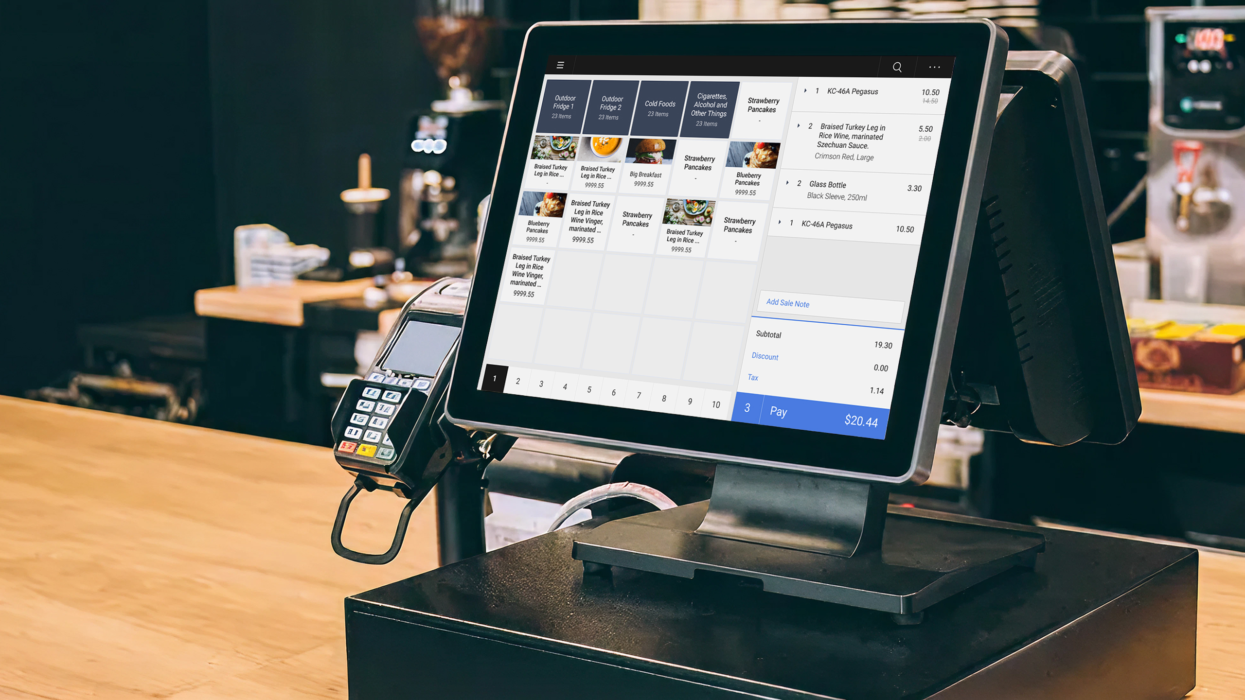
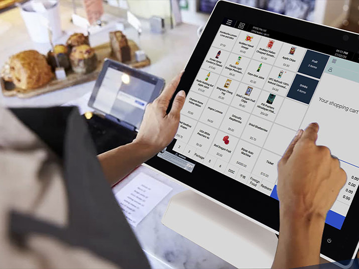
POS Front End
The main cashier interface designed for speed and accuracy during high-pressure situations
Back End Dashboard
Analytics and management interface for business owners and managers
Mobile Ordering App
Native mobile app for customers to order ahead and earn rewards
Outcomes & Impact
Built from zero into one of Singapore's leading POS platforms — trusted by thousands of businesses by 2021.
Average transaction completion time reduced from 45s to 6s based on time-on-task measurements across 500+ transactions
System Usability Scale (SUS) score from staff after 30 days, up from 58% with previous system
Order accuracy improved significantly due to clear visual feedback and confirmation patterns
New staff onboarding time reduced from 8+ hours to under 2 hours without sacrificing capability
Key Learnings
- 1 Testing in real-world conditions during peak hours revealed issues that lab testing missed, particularly around speed and error recovery.
- 2 Staff and owners had very different needs - creating separate but connected interfaces proved more effective than a one-size-fits-all approach.
- 3 Offline-first design was non-negotiable for reliability, which shaped early architectural decisions and informed the entire experience.